 Tweet
Tweet
Today I am going to focus on one area of numismatic errors, wildly rotated repunched mintmarks. Specifically, ones that are rotated to the point they are nearly horizontal or inverted. To explore them, I needed to use overlays, but first I need to establish their limits. Just because there is the appearance of an underlying wildly rotated mintmark, does not mean there is compelling evidence to back it up. To help resolve the question, attributers make overlays of key areas. My experience with overlays has shown that they rarely fully establish, or visibly link up, with all of the observed details. They can be extremely close, but I always find slight discrepancies. An example I can show would be the four class 3 1960 small date over or under a large date Lincoln cents. Overlays I have made are very close in matching up on most of the date, but some small areas do not match. Does it matter? I have no plausible alternate theory, I just chalk it up to the limits of photographing elements of struck coins and then reusing them in overlays. Regarding the 1960 Lincolns, the one area that is most frequently off is the 0 and you can see that in the below overlays:

Another issue demonstrating the limits of overlays is the Lincoln cent 1980D with a supposed OMM. Overlays matched up with the known S mintmark for that year, and it was once listed as a OMM, but we now know that the appearance of the S is really the worn remnants of a gouge as shown on the stage A example below:

Something I else I should note with the diagnosis of varieties, is that with many times an attributer does their best to imagine scenarios where two metal objects, one an annealed (soft) die face, and the other being a tempered (or hard) object that makes impressions into the die. The object creating an impression most often would be a hub, old digit punches for dates or mintmark punches. Facets of the tempered object may not penetrate the die face equally. The object making an impression could be oriented any number of ways so that primary plane (or face) is not straight with the plane of the die. All factors that cannot be fully accounted for in an overlay, if accounted for at all visually.
Before I continue, I want to outline some proper font terminology in the below diagram. We have serifs, a stem, a bowl and a spine:

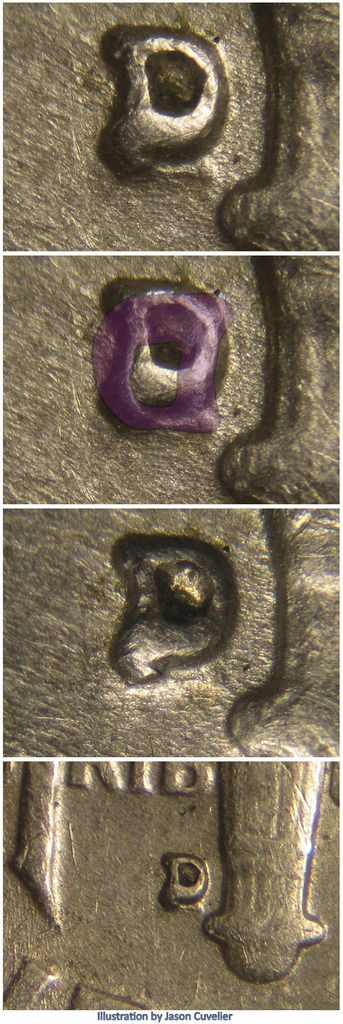
We are going to start with a Lincoln cent listing that is probably the most straight forward and least disputed of my examples: 1961D RPM-001. This RPM shows an extra rotated D that is 90 degrees off relative to its normal position. It is called a horizontal D, most likely in reference to the normally vertically side, the stem, mistakenly oriented horizontally. Below I show the horizontal D in green and then indicate the approximate high point of the MM punch in red. With enough of the horizontal D showing, matching the size, high points and even the shape of the D, it is hard to argue with the attribution.

Our second example is a Roosevelt dime: 1959D RPM-002. Here we have a supposed inverted D. We see something resembling the upper serif and top most curve of the bowl upside down and below the correct D's bowl. There is also another anomaly, possibly another punching, below the lower serf. CONECA lists it as a triple repunched mintmark (D/D/D). My overlay is in purple, and while there is not a lot to work with, what is seen matches up with the upper stem and serif.
Next I have a Washington quarter known as 1956 RPM-001 with an apparent inverted D. Instead of a thin defined ridge representing the high point of the MM punch, we see a thicker flat part of the curved bowl inside the normal D's bowl. The size matches, but what is odd is if the punching was that deep, why do not we not see some indication of the serifs or the stem? Do we need to see them? Could they have been abraded off when the Mint worker realized they made a mistake? My overlay is in red and I have shown the approximate high point as well:
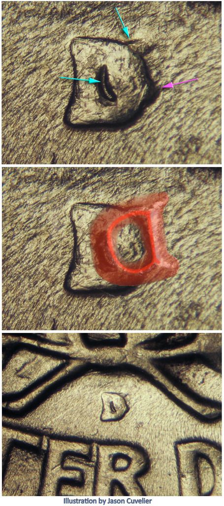
Here we have a Lincoln cent listed as 1950D RPM-003, CONECA does not recognize it as a horizontal re-punching whereas other attributers do. The area of concern is probably the the curved area seen that does indeed match the size of the upper curve of the bowl. The overlay is a green D with the high points in red. If you disregard the light curved remnants, which could be a die gouge I suppose, you would have reasonably defined upper serif and a fragment of the stem only. I have added an overlay showing a normal repunched D in purple:

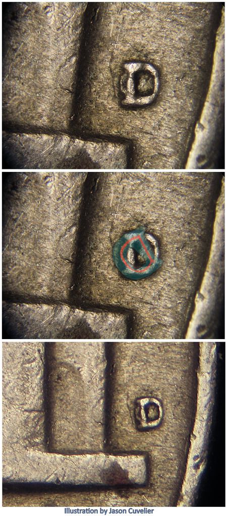
Now we have Jefferson nickel 1946D RPM-002, listed by CONECA as a D over a inverted D. The possible inverted D is blue in my overlay with the high point in red and like the others, rotated to match the high point as best as I can get it. What bothers me here, like with the 1956D quarter, is how well defined the bowl is, but there is no evidence of serifs or the stem:
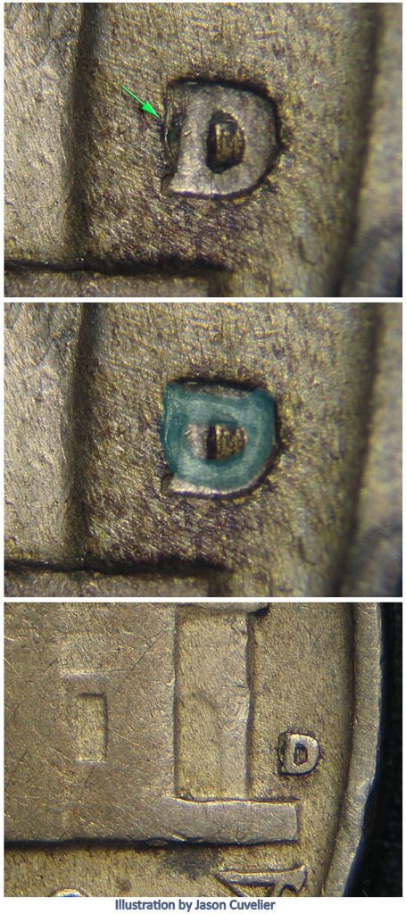
Here I have another Jefferson nickel, listed by CONECA as 1942D RPM-001 with a noted horizontal D. Here in blue, my overlay shows the lower bowl and the point of intersect of the serif and stem fit nicely. Any other remnants of this horizontal punching would be concealed with the normal punching:
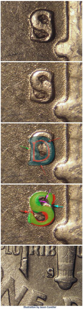
Our final example is a Roosevelt dime listed as 1950S RPM-005. This was listed at one point as OMM-001, but was changed to a S punched over an inverted S. My overlay for the possible D is in green with a red high point. The D is convincing, but I have to admit the inverted S, red in my overlay with the normal S in green, matches up the serifs more specifically. While this attribution of an inverted S is better for me than a underlying D, it is not perfect either as the inverted S theory cannot seem to address the ridge seen inside the upper S above the stem and below the serif. That curve is a little wonky, but does fit my D overlay:
Another issue demonstrating the limits of overlays is the Lincoln cent 1980D with a supposed OMM. Overlays matched up with the known S mintmark for that year, and it was once listed as a OMM, but we now know that the appearance of the S is really the worn remnants of a gouge as shown on the stage A example below:
Before I continue, I want to outline some proper font terminology in the below diagram. We have serifs, a stem, a bowl and a spine:
We are going to start with a Lincoln cent listing that is probably the most straight forward and least disputed of my examples: 1961D RPM-001. This RPM shows an extra rotated D that is 90 degrees off relative to its normal position. It is called a horizontal D, most likely in reference to the normally vertically side, the stem, mistakenly oriented horizontally. Below I show the horizontal D in green and then indicate the approximate high point of the MM punch in red. With enough of the horizontal D showing, matching the size, high points and even the shape of the D, it is hard to argue with the attribution.

Our second example is a Roosevelt dime: 1959D RPM-002. Here we have a supposed inverted D. We see something resembling the upper serif and top most curve of the bowl upside down and below the correct D's bowl. There is also another anomaly, possibly another punching, below the lower serf. CONECA lists it as a triple repunched mintmark (D/D/D). My overlay is in purple, and while there is not a lot to work with, what is seen matches up with the upper stem and serif.
Next I have a Washington quarter known as 1956 RPM-001 with an apparent inverted D. Instead of a thin defined ridge representing the high point of the MM punch, we see a thicker flat part of the curved bowl inside the normal D's bowl. The size matches, but what is odd is if the punching was that deep, why do not we not see some indication of the serifs or the stem? Do we need to see them? Could they have been abraded off when the Mint worker realized they made a mistake? My overlay is in red and I have shown the approximate high point as well:
Here we have a Lincoln cent listed as 1950D RPM-003, CONECA does not recognize it as a horizontal re-punching whereas other attributers do. The area of concern is probably the the curved area seen that does indeed match the size of the upper curve of the bowl. The overlay is a green D with the high points in red. If you disregard the light curved remnants, which could be a die gouge I suppose, you would have reasonably defined upper serif and a fragment of the stem only. I have added an overlay showing a normal repunched D in purple:
Now we have Jefferson nickel 1946D RPM-002, listed by CONECA as a D over a inverted D. The possible inverted D is blue in my overlay with the high point in red and like the others, rotated to match the high point as best as I can get it. What bothers me here, like with the 1956D quarter, is how well defined the bowl is, but there is no evidence of serifs or the stem:

Here I have another Jefferson nickel, listed by CONECA as 1942D RPM-001 with a noted horizontal D. Here in blue, my overlay shows the lower bowl and the point of intersect of the serif and stem fit nicely. Any other remnants of this horizontal punching would be concealed with the normal punching:
Our final example is a Roosevelt dime listed as 1950S RPM-005. This was listed at one point as OMM-001, but was changed to a S punched over an inverted S. My overlay for the possible D is in green with a red high point. The D is convincing, but I have to admit the inverted S, red in my overlay with the normal S in green, matches up the serifs more specifically. While this attribution of an inverted S is better for me than a underlying D, it is not perfect either as the inverted S theory cannot seem to address the ridge seen inside the upper S above the stem and below the serif. That curve is a little wonky, but does fit my D overlay:

 Be verwy verwy quiet... I'm hunting coins!!!


Comment