 Tweet
Tweet
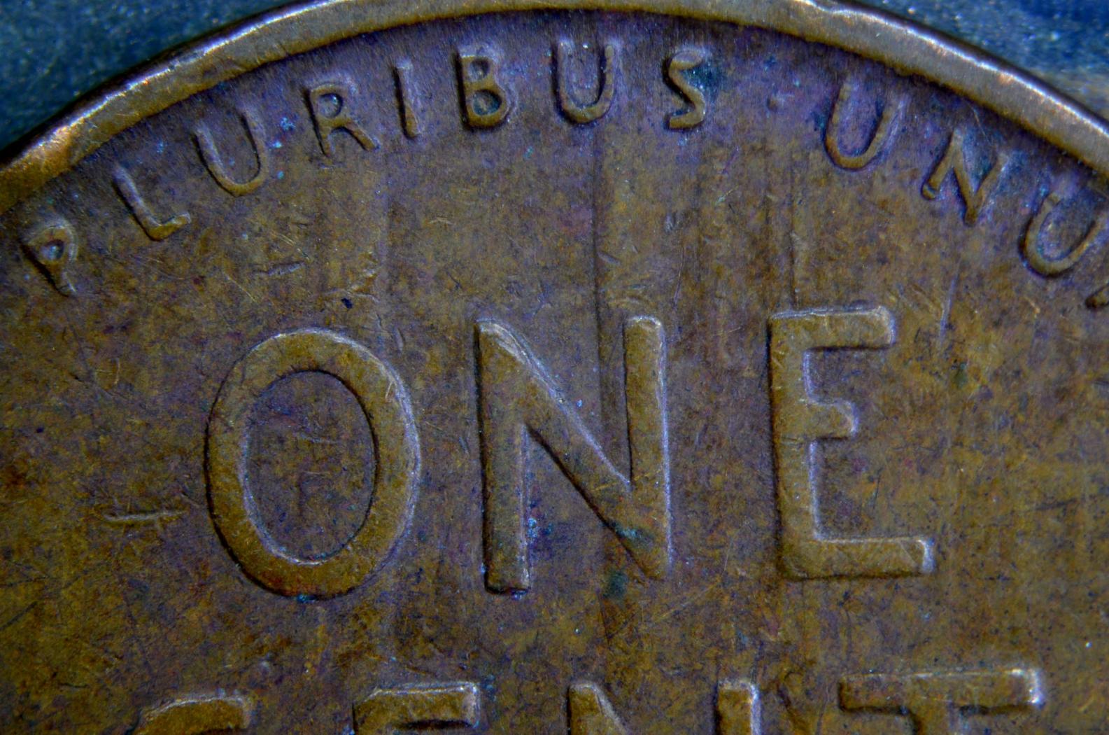
I am completely unsure what this one is. I'll try my best to explain what I'm seeing and hopefully the images are good enough to show it completely.
The obverse looks perfectly normal to me for a circulated coin.
The top center of the reverse looks like a normal, well struck cent.
Beginning at the U in Pluribus, and the O in One, and moving left, there is a slight, yet abrupt "step up" to the surface of the coin. The letters involved in the step up (PL) are not as well struck as the center letters. By this I mean they aren't as tall, vertically from the field, as the center letters. Then, as you continue left, there is a slightly wavy decent back to the normal elevation of the field. By the time you get to E, in EPU, it's well struck again.
Beginning in the middle of the N in Unum, and down to the right tip of the T in Cent, and moving right, there is a much sharper "step up" to the surface of the coin. The same attributes apply to the devices. The letters don't look as well struck, or tall vertically, as the should be. The only difference is that there isn't a subtle decent to normal. The "weakly struck" look continues to the rim. It even continues through the tip of the right wheat.
The crossbar of the T is as far south as I notice anything. i have never seen this before. Any ideas?

 Be verwy verwy quiet... I'm hunting coins!!!


Comment