You are currently viewing our boards as a guest which gives you limited access to view most discussions and access our other features. By joining our community you will have access to post topics, communicate privately with other members, respond to polls, upload content and access many other special features.
For more information on registration and an upgrade to Paid and Premium Memberships go to our Membership page and join our community today!
If you have any problems with the registration process or your account login, please contact contact us.
If this is your first visit, be sure to
check out the FAQ by clicking the
link above. You may have to register
before you can post: click the register link above to proceed. To start viewing messages,
select the forum that you want to visit from the selection below.
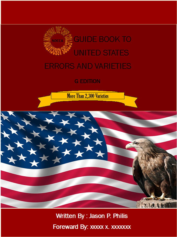
Ok no more USSR Lets do this version a little more eye friendly, more US friendly and maybe more professional.No coins on the front cover but I can put one where the eagle is. I dont want to put a coin over the flag. I posted the color change on the back but not the new text I have a version here with no more variations but Varieties. I didnt over look that change on my copy
Last edited by atarian; 04-14-2012, 10:08 AM.
Reason: New cover idea
<3 In memory of Tiggar 5/21/1994 - 5/28/2010 <3 WAM Count : 025 .
Founder of the NDCCA. ** NDCCA Catalog Database Total. : 2,735. ** -- Jay --
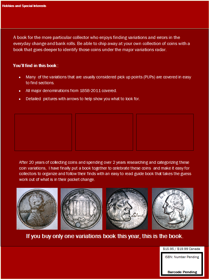
I like the spine and reverse side layouts. The front seems to lacking something. I think I would replace the middle picture with something much larger.
I have to agree that the color choice of the front could be better and that you could increase the images of the coins on the F/Cover thereby utilizing most of the available space. Second point is that the use of white with jagged edges (2,300 variations) doesn't fit in with the theme of the F/C.That gave it an odd look. I would have used an oblong or square space to insert the number with a colored background.
That's what I see so far. What about using the hues seen on toning on some lincoln cents as your background. That might be much more appealing.
Being honest....the color selection for the cover is - well - horrible. It looks like a Chinese or Soviet military training manual.
I agree. I would have someone that is more into designing things like this do the work. Doing it yourself could save money but hurt you at the same time.
Im looking and waiting to hear back from a few people but I figure until I find a designer who knows what they are doing I figured it wouldnt hurt to attempt this ( Sorry for hurting eyes ). I did a 2nd color variation that was alot like cherrypickers and then a green combo which both looked better than the one here posted. For as doing a wood grain affect Boy would I love to do that BUT dont know how to do that. For as the jagged edge talker, I could go and try a few other shapes. I was thinking the 3 photo set in the begining cause if i did one it would look more blah, but let me see what I can come up with .
<3 In memory of Tiggar 5/21/1994 - 5/28/2010 <3 WAM Count : 025 .
Founder of the NDCCA. ** NDCCA Catalog Database Total. : 2,735. ** -- Jay --
Here's a quick 5 minute rendition of a minimalistic cover design... minus the horrible red border at the bottom of the image. Sorry, this was a quick overlay job.
A great start, Jay. You're really coming along with things. Can I ask... what's with the Golden Eagle? Is it supposed to be a Bald Eagle? I agree with Roger that there should be some mention of coins. From the cover, someone who didn't know any better might think the book was on mistakes made by the United States throughout history.
-Sean
Search started in Sep 2011. 913,650 cents searched as of 9/24/13.
I was thinking an eagle has an eagle eye. And an eagle eye would be someone that would look for die cracks chips and othe easy to miss varieties. But I can swap it out for a coin if it puts it more on point
and yes this is my book just working on the covers 190 pages in all 2,396 coins and over 3700 pictures.
 Tweet
Tweet

 In memory of Tiggar 5/21/1994 - 5/28/2010


Comment